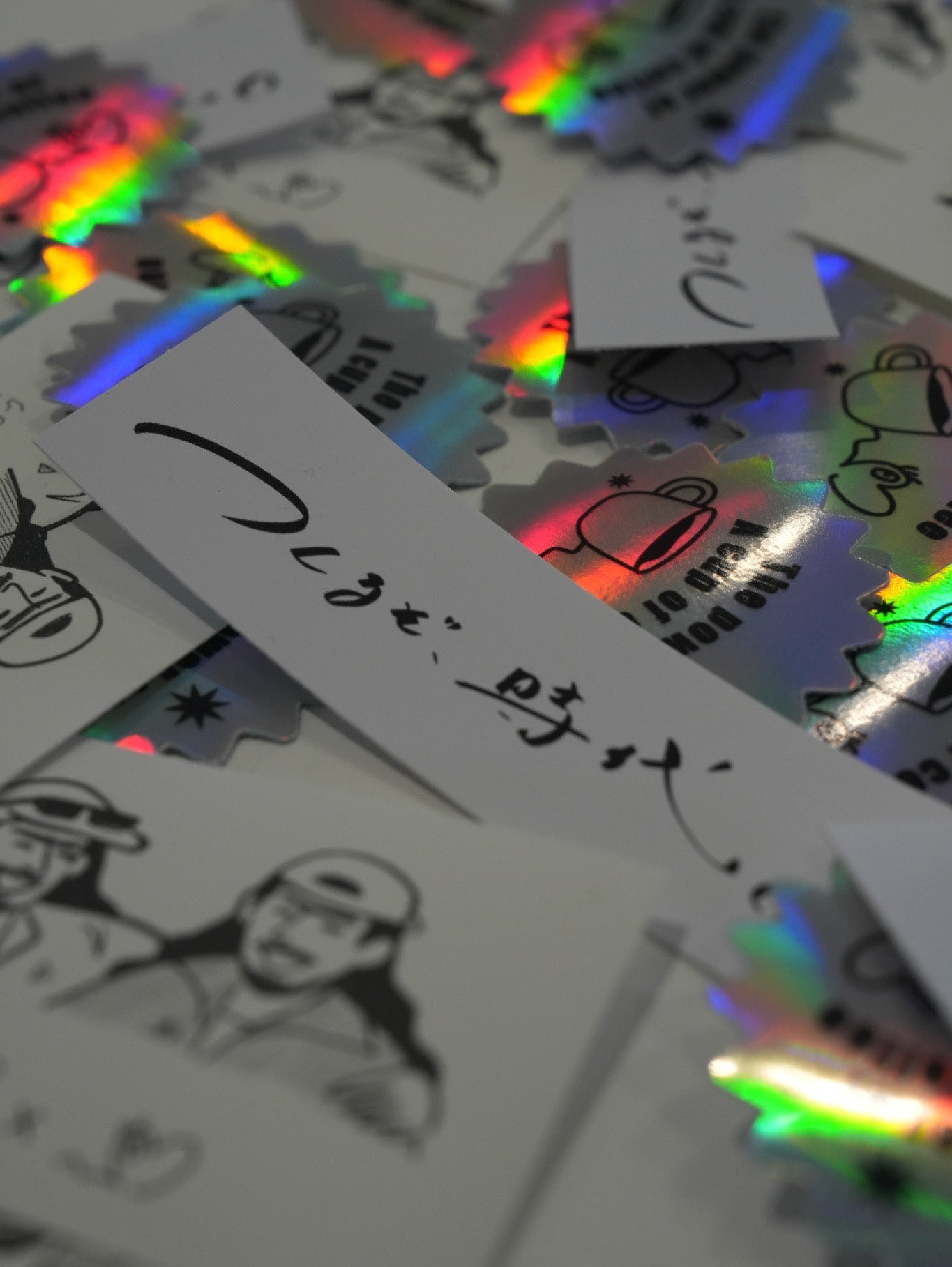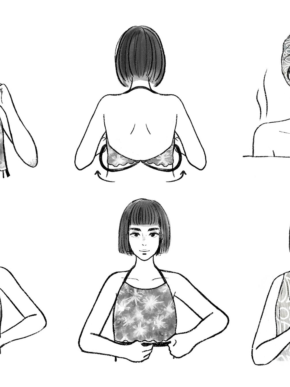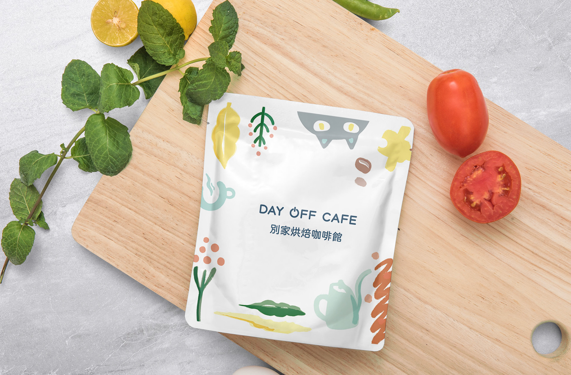
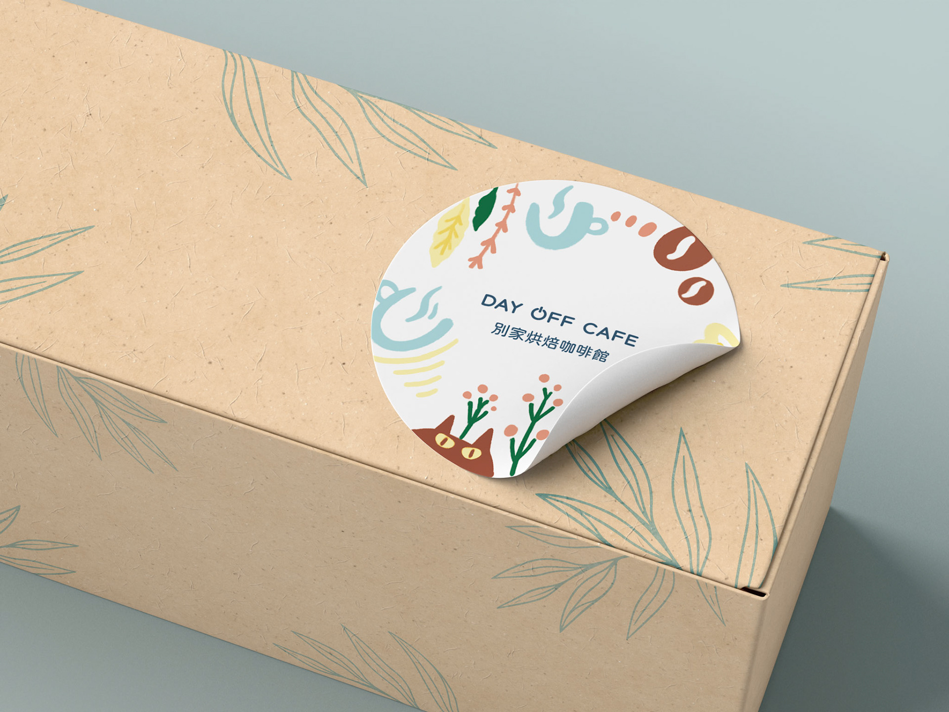
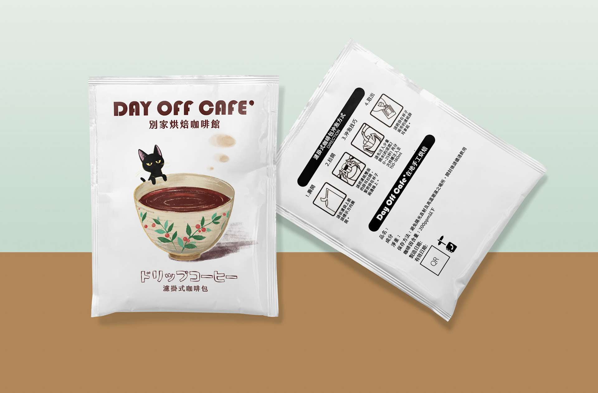
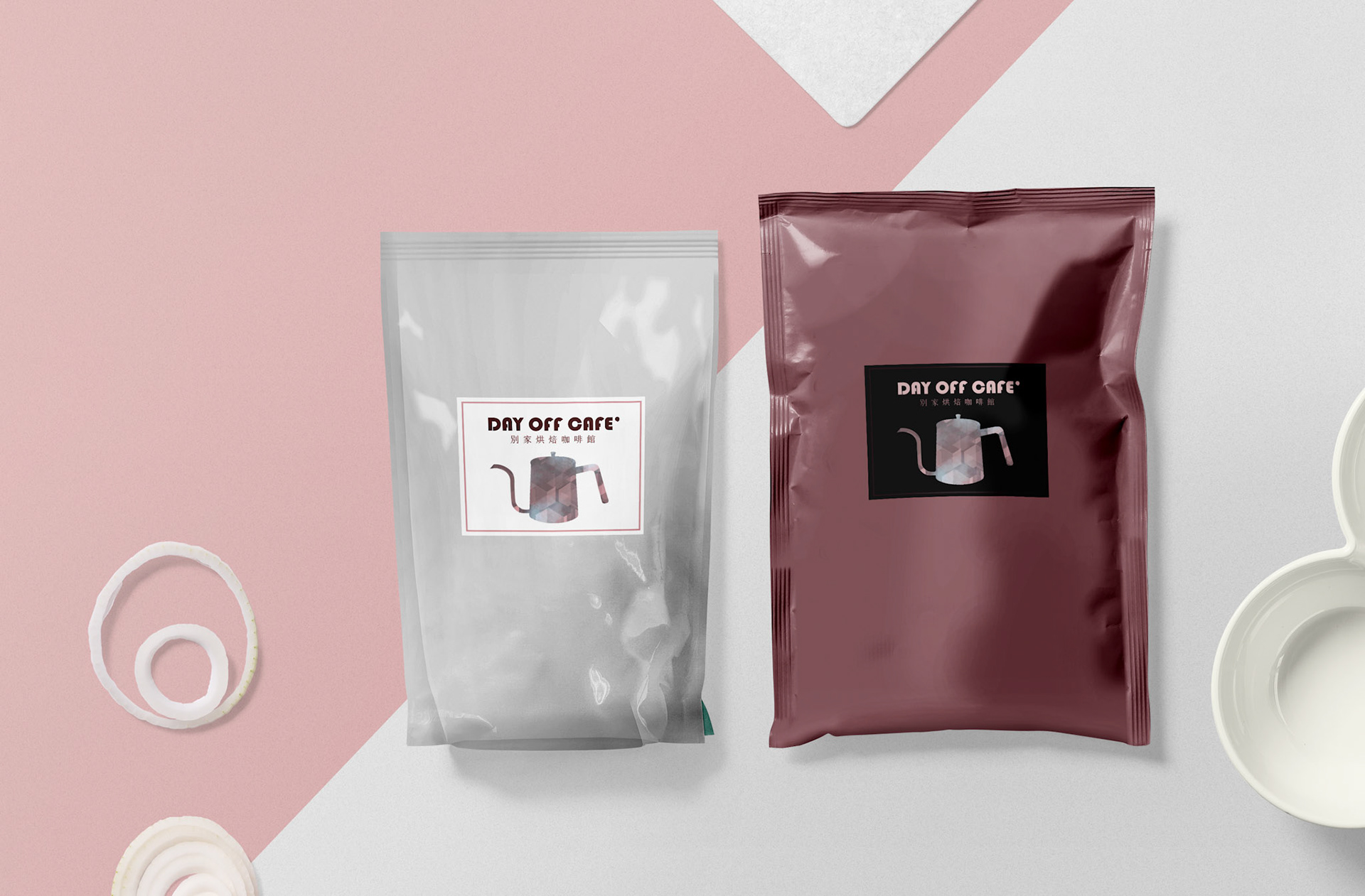
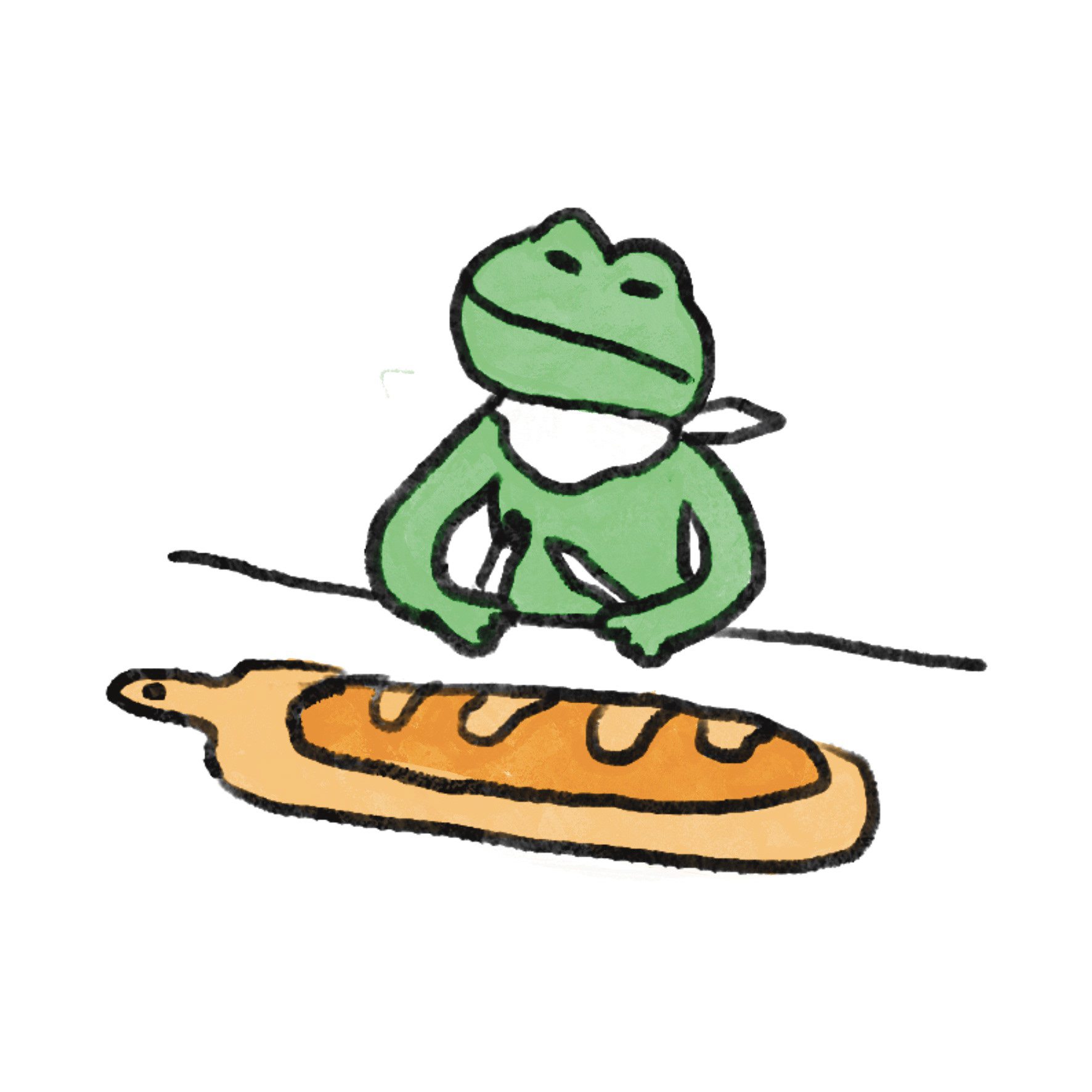
day off cafe wanted packaging that felt like a new release each time, without redrawing the brand every round. So I fixed the frame — wordmark, colour, format — and let the illustration change per run: a botanical kitchen pattern for one, a cat-and-cup scene for the next. Same shelf, different season. Delivered — 2 drip bag designs on the supplier's dieline (100 × 120mm, roll-fed) · bean pouch labels · die-cut seal sticker · JP brewing instruction icons the smallest surface is 100 × 120mm, printed roll-fed on matte film. Fine lines vanish into it, so every motif is built from flat shapes with weight — whatever the release. Client work.